


4SilentRebels.com Gets a Fresh Look with a Clearer Purpose and Stronger Impact
A website should feel like a door opening, not a hallway full of noise.
That was the idea behind the update to 4SilentRebels.com. The new site has a fresh look, a clearer purpose, and a stronger sense of what this community is here to do. It is built for people looking for connection, support, encouragement, and a place that reflects real stories with care.
The mission has not changed. The energy around it has grown.
This update is more than a visual refresh. It is a renewed commitment to making the site easier to explore, easier to understand, and easier to return to when someone needs inspiration or a reminder that they are not walking alone.
Whether the visit starts with curiosity, a need for support, or a desire to feel part of something meaningful, the new experience is designed to meet people with clarity.

The site now feels closer to the mission
A good website does not need to be complicated to be powerful. It needs to make the purpose clear.
The refreshed 4SilentRebels.com is built around that idea. Every part of the update points back to the same message: this is a space for community, support, and inspiration.
That means the experience should feel intentional from the first visit. The look, layout, and language all work together to make the site easier to take in. People should not have to search hard to understand what the movement stands for or why it matters.
The updated site gives more room to the values at the center of the work:
Community
A sense of belonging matters. The site now gives that idea more presence and more weight.
Support
People often come to a mission-driven site because they are looking for something real. The new experience helps make that support easier to find.
Inspiration
Stories, messages, and shared purpose can help people keep going. The site is shaped to make that kind of encouragement easier to reach.
Growth
A strong community does not stay still. The update gives the site space to grow as the mission grows.
The result is a site that feels more focused. It gives visitors a clearer understanding of who 4SilentRebels is, what it stands for, and why the work continues to matter.
A fresh look can change how people feel when they arrive
Design is not only about how a site looks. It also shapes how people feel as they move through it.
A cluttered or unclear site can make even a strong mission feel distant. A thoughtful site can do the opposite. It can create calm. It can invite people in. It can help a message land before a visitor reads every word.
The new look is meant to feel more open and direct. That matters because people visit for different reasons. Some may want to learn. Some may be looking for encouragement. Some may be ready to connect. Some may only know that something about the mission caught their attention.
The refreshed site gives each of those visits a better starting point.
A stronger visual experience can help in simple but meaningful ways:
It helps visitors understand where they are.
It makes the message easier to follow.
It gives the work a more polished home.
It creates a sense of care and attention.
It helps people stay longer and explore more.
That last point is especially important. When a site feels clear and welcoming, visitors are more likely to look around. They may read more, share more, return later, or reach out. Small design choices can support bigger human actions.
The update to 4SilentRebels.com is part of that work. It helps the digital space match the heart behind the mission.
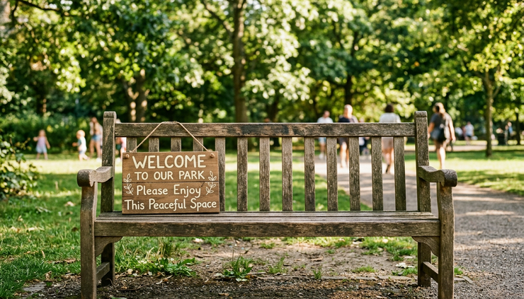
Clearer purpose makes the message stronger
Purpose can get lost when a site tries to say too much at once. The best online spaces guide people without overwhelming them.
The refreshed site puts focus first.
Instead of making visitors piece everything together, the update helps answer the questions that often sit in the back of someone’s mind:
What is this community about?
Is there a place for me here?
What can I learn or take with me?
How can I connect?
Why does this mission matter now?
These questions deserve clear answers.
A clearer purpose does not mean the work has become smaller. It means the message has become easier to carry. When people understand the purpose quickly, they can spend less time figuring things out and more time engaging with what matters.
That clarity also strengthens trust. Visitors should feel that the site knows what it wants to say. They should feel that the mission has direction. They should sense that the space was built with care, not thrown together.
This is where the update carries real weight. It helps turn the site from a place people visit into a place people can use.
Stronger impact starts with better access
Impact often begins with access. If people cannot find what they need, the message cannot reach them as fully as it should.
The new site experience is built to make exploration more natural. That supports people who arrive with different levels of familiarity. Some may already know the mission. Others may be hearing about it for the first time.
A strong site respects both.
For returning visitors, the update brings renewed energy. It signals growth. It shows that the mission is active and moving with intention.
For new visitors, the update lowers the barrier to entry. It gives them a clear path to understand the community and decide how they want to connect.
That kind of access is not only technical. It is emotional, too.
A person is more likely to engage when a space feels welcoming. They are more likely to keep reading when the tone feels human. They are more likely to come back when the message feels steady and sincere.
The updated site creates that kind of path.
It does not ask people to understand everything at once. It invites them to explore, connect, and grow at their own pace.
The same mission now has more room to move
“New energy. New vision. Same mission.”
That line carries the heart of this update.
A site refresh can sometimes feel like a full reset. This one is different. The work is not moving away from its roots. It is making more room for them.
The mission remains grounded in the same values. The update simply gives those values a clearer home. It helps the site reflect the growth that has already happened and the growth still ahead.
That balance matters.
Change is healthy when it honors what came before. A fresh look can bring new attention, but the deeper purpose gives the update meaning. A clearer site can help more people connect, but the mission gives them a reason to stay.
The refreshed site carries both sides.
It brings new energy without losing its center. It offers a new vision without replacing the original reason for the work. It strengthens the impact by making the mission easier to see, feel, and share.

Community is still at the center
Community can be hard to define because it is something people feel before they can explain it.
It shows up when someone feels seen. It shows up when a story sounds familiar. It shows up when a message helps a person breathe a little easier. It shows up when people choose to stand beside one another, even in quiet ways.
The updated site keeps that idea at the center.
This matters because online spaces can feel distant. A mission-based website should feel different. It should remind people that behind the pages, posts, and updates, there are real people and real reasons for the work.
The site now does a better job of making that human connection visible.
That does not mean every visitor will come for the same thing. Community has many entry points. Some people connect through shared values. Some connect through support. Some connect through curiosity. Some come because they need hope.
The refreshed site leaves room for all of that.
It gives the community a clearer home, not only as an idea, but as a lived experience people can recognize when they arrive.
Support should be easier to find
Support is not always loud. Sometimes it looks like a sentence that helps someone feel less alone. Sometimes it looks like a story shared at the right time. Sometimes it looks like a place where people can return when they need steadiness.
The new site supports that kind of experience by making the purpose more visible and the space easier to navigate.
When people seek support, they should not have to work hard to find a sign of care. The site now better reflects that need. It creates a calmer, more direct path for visitors who want to understand what the community offers and how it can speak to their own experience.
That does not mean the site has to solve everything for everyone. No website can do that.
But a website can create a starting point. It can make the mission feel reachable. It can offer words, stories, and connections that help people take the next step.
The refresh was shaped with that in mind.
Inspiration needs space to breathe
Inspiration works best when it feels honest.
People do not need empty slogans. They need reminders that growth is possible, that connection matters, and that a shared mission can still make a difference. They need messages that feel grounded enough to trust.
That is part of what the new site is designed to support.
The refreshed experience gives inspiration more space. It is not buried under confusion or scattered direction. The site can now carry encouragement in a cleaner, stronger way.
This matters because inspiration is often the spark that leads someone to stay involved. A visitor may arrive for one reason and leave with something they did not expect: a renewed sense of possibility, a connection to a message, or a reason to come back.
A site with clearer purpose can help that happen more often.
The refresh is also a promise
An updated website sends a message before any announcement does.
It says the work is active. It says the people behind it are paying attention. It says the mission deserves a home that reflects its value.
This refresh is a promise to keep building with care.
It is also an invitation. Explore the new space. Notice what feels different. Take in the new energy. Share the site with someone who may need it. Return when the message speaks to where you are.
That kind of invitation matters because communities grow through participation. They grow when people show up, read, listen, share, ask, support, and come back.
The new site gives those actions a stronger place to happen.
What this next chapter means
A fresh site does not carry the mission by itself. People do.
The updated 4SilentRebels.com gives the mission a clearer space, but the real impact still comes from the community around it. It comes from every person who connects with the message, finds support, shares encouragement, or helps the vision reach someone new.
That is the heart of this next chapter.
The site has changed, but the reason behind it remains steady. The look is fresher. The purpose is clearer. The impact can reach further. The mission is the same.

New energy. New vision. Same mission.
The refreshed site is ready to welcome people in.
It is a space built for community, support, inspiration, and growth. It reflects who 4SilentRebels is and what the mission continues to stand for. Most of all, it creates a clearer path for people to explore, connect, and grow together.
Go take a look around. Let the new space speak for itself. Then come back, share it, and keep building the mission with us.


Comments